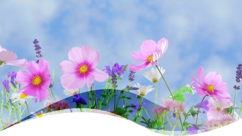


Simple Xara Photo Gallery
Each photo gas been given a class name “htmlclass=frame” to provide a similar border and shadow to its popup:
<style>.frame {border-style: solid; border-color: white; border-radius: 8px; box-shadow: 2px 2px 2px 1px rgba(0, 0, 0, 0.4)}
</style>
The code is placed in the Page HTML code(head).

<style>
.innerZoom {
background-size: 100%;
background-position: center center;
transition: 1s ease-in-out;
}
.innerZoom:hover {
background-repeat: no repeat;
background-size: 130%;
}
</style>
<script>
$('.inzoom').each( function(){
$(this).replaceWith('<div class="xr_noreset " style="position: absolute;
' + $(this).attr("style") + '"><div class="innerZoom" style="background-
image:url(' + $(this).attr("src") + '); width: 100%; height:
100%;"></div></div>');
});
</script>
Script courtesy of Acorn, Talk Graphics
Simple Enlarge

<style>
.zoom {transition: 1s ease-in-out;} .zoom:hover {transform: scale(1.5);}
</style>
NAME: htmlclass=”inzoom”
NAME: htmlclass=”zoom”
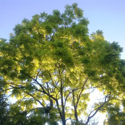
Inner Zoom Example


Filters for Hovers - B&W & Sepia Filters
<style>
.bw {
transition: filter .5s ease-in-out;
filter: grayscale(100%);
}
.bw:hover {
filter: grayscale(0%);
}
.sepia {
transition: filter .5s ease-in-out;
filter: sepia(80%);
}
.sepia:hover {
filter: sepia(0%);
}
</style>
Add Names: htmlclass=”bw” & htmlclass=”sepia”


Standard MouseOff and MouseOver layers, soft-grouped together, the
Heading image was created using shapes and transparencies. Cursor is
changed to leave it as a pointer:
<style>
.null-link {
cursor: default;
}
</style>