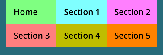
Section 1
Section 5
Section 4
Section 3
Section 2
Home

This is a simple example for a mobile menu.
The menu is placed at the top of the page (in
this case a single page), is non-sticky and
therefore moves out-of-sight as the visitor
scrolls down the page. At the very top of there
is a slim sticky rectangle and a sticky icon of
choice. The icon has a standard link ‘Top-of-
Page’. The effect, when pressed is to return is
the page scrolled back its top and in doing so,
brings the menu back into view - nothing more
to it than that!
The two menu blocks butt together and where
the rectangles are the same colour, it creates
the impression they are one.
Any top bar objects are set to be ‘sticky’ and
placed at the top-of-page. The second block of
links can be either headings or anchors as in
this example, but could be equally links to
pages or anything of the designer’s choosing.
This bar and group of objects are set to be
non-sticky and as the visitor scrolls down the
page they scroll upwards and out-of-sight.
This setup could used for a single page with
headings and anchors, or as a standard page-
menu across multiple pages. It can be used
too in conjunction with a standard mobile
popup menu to provide on-page navigation
between sections.


Magna id esse exercitation ex occaecat sint
anim quis adipisicing in aliquip est in pariatur
id. Culpa, irure amet est nisi minim aute non
deserunt ad nostrud est in dolore proident
tempor magna: Nulla excepteur reprehenderit
proident reprehenderit non ex cupidatat id
non sit aliquip minim incididunt cupidatat. Ut
esse et excepteur voluptate amet culpa. Anim
duis velit fugiat consequat culpa, ea adipisicing
ut culpa tempor dolore sint ut amet
exercitation dolore.


Consequat ea enim cillum tempor adipisicing
elit dolore irure ipsum deserunt exercitation.
Minim anim ullamco eu dolor amet
exercitation pariatur culpa irure id do fugiat
mollit in ut lorem dolor nulla. Esse consectetur
culpa aute, do irure ullamco voluptate.
Adipisicing dolor, commodo reprehenderit
consequat velit esse veniam ipsum mollit.

