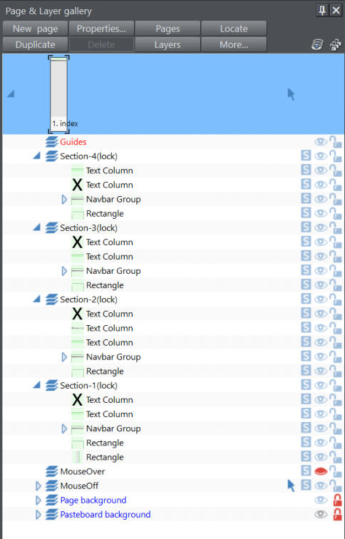
The Quick Reference List is in practice site-map menu for any internal and external links as required. In this example, there are four sections
where the description is of the designer’s choice; there could be one to many sections and the dropdown menus are standard Xara NavBars.
The key to transitioning this format to mobile variant is to make the width of
each NavBar no greater than the width of the mobile variant. For the mobile
variant, each NavBar is placed on it own layer as a popup which is called from
the MouseOff layer.
In this example a (lock) is added to the name of each section popup; this ensures
the popup is not inadvertently closed when the visitor is trying to use a link on
that popup. The visitor can then pick any link, or close the popup with a link to
“popup: close”. These features are part of Xara’s “Undocumented Features”.
Transition from desktop to mobile variant is managed through the ‘Scale-to-fit-
Width’ option (introduced in v16.3), This ensures that whatever devices the
website is displayed on, it proportionally displays correctly.

MINT
The Quick Reference List is in practice site-map
menu for any internal and external links as
required. In this example, there are four
sections where the description is of the
designer’s choice; there could be one to many
sections and the dropdown menus are
standard Xara NavBars.
The key to transitioning this format to mobile
variant is to make the width of each NavBar no
greater than the width of the mobile variant.
For the mobile variant, each NavBar is placed
on it own layer as a popup which is called from
the MouseOff layer.
In this example a (lock) is added to the name of
each section popup; this ensures the popup is
not inadvertently closed when the visitor is
trying to use a link on that popup. The visitor
can then pick any link, or close the popup with
a link to “popup: close”. These features are part
of Xara’s “Undocumented Features”.
Transition from desktop to mobile variant is
managed through the ‘Scale-to-fit-Width’ option
(introduced in v16.3), This ensures that
whatever devices the website is displayed on, it
proportionally displays correctly.
MINT


QUICK REFERENCE LIST


