This is a simple desktop and mobile menu
1.
Page links are text on the MouseOff layer ONLY. To make life easier we have created text styles, such as ‘Menu Text’
which sets a chosen font, size and colour, the latter has a ‘named’ colour.
2.
In this example, the rectangle in the header has a linear vertical fill with two end points, the top set the darker colour,
the bottom set the the lighter colour. But a plain rectangle will suffice. The underline, again optional is a thin rectangle.
Both the rectangles can be optionally set to full width and sticky; they are in this example.
3.
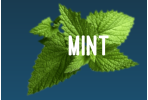
Logos or similar can be placed in the design such that they will sit to the right and left-hand edges of the browser. This
requires them to be either a group or an image and they must be sticky too. The trick to have them just inside the edge
of the browser requires the designer to add some padding to each group. In this case, the logo is a transparent image,
with a rectangle that extends to the left on the image (padding for the browser) and text line, grouped. For the text ‘Mint’
this is standard text with several spaces to the right, and then grouped.
4.
The key to making this work across all devices is to ensure as you squeeze the browser and the objects move towards
one another that at no point do they overlap. This works best by using the Scale-to-fit-Width export option alongside a
mobile variant.
5.
The Products and Services links are to menu pages that offer the opportunity to create picture, photo & graphic menu
links to other pages, or anywhere else the designer chooses.
This is a simple desktop and mobile menu
1.
Page links are text on the MouseOff layer
ONLY. To make life easier we have
created text styles, such as ‘Menu Text’
which sets a chosen font, size and colour,
the latter has a ‘named’ colour.
2.
In this example, the rectangle in the
header has a linear vertical fill with two
end points, the top set the darker colour,
the bottom set the the lighter colour. But
a plain rectangle will suffice. The
underline, again optional is a thin
rectangle. Both the rectangles can be
optionally set to full width and sticky;
they are in this example.
3.
Logos or similar can be placed in the
design such that they will sit to the right
and left-hand edges of the browser. This
requires them to be either a group or an
image and they must be sticky too. The
trick to have them just inside the edge of
the browser requires the designer to add
some padding to each group. In this case,
the logo is a transparent image, with a
rectangle that extends to the left on the
image (padding for the browser) and text
line, grouped. For the text ‘Mint’ this is
standard text with several spaces to the
right, and then grouped.
4.
The key to making this work across all
devices is to ensure as you squeeze the
browser and the objects move towards
one another that at no point do they
overlap. This works best by using the
Scale-to-fit-Width export option alongside
a mobile variant.
5.
The Products and Services links are to
menu pages that offer the opportunity to
create picture, photo & graphic menu
links to other pages, or anywhere else the
designer chooses.