Using the Mobile Menu Concept for All variants
Sometimes a designer might want to create a banner heading; video, slider or photo. Am alternative to a horizontal menu that sits over the banner heading, could be a slide-in mobile style menu; it can be used for both desktop and mobile variants. In this example, a mobile menu is created on a standard pop-up layer that is accessed with a hamburger icon. The trick to making the menu slide (without code) is to create any transitions (e.g. slide in from left) on the MouseOff and MouseOver layers first, then copy them to their corresponding pop-up layers. In this example they are ‘SidebarMenu(lock)’ and ‘MouseOverSidebarMenu’ - this is necessary because Xara objects to popups with transitions, but does not object to a designer placing previously animated objects onto a popup layer. One can use standard button links or create a standard NavBar from those buttons. Any other objects, including a close button are created in the same way; create them on the MouseOff layer, animate as required and copy to the side bar layers. The (lock) extension to the pop-up layer name prevents it automatically closing until a link is executed. Any grouped objects that are sticky and animated and placed off-page have to be exported as a single image. The closing icon on the popup layer is given a link “popup: close”.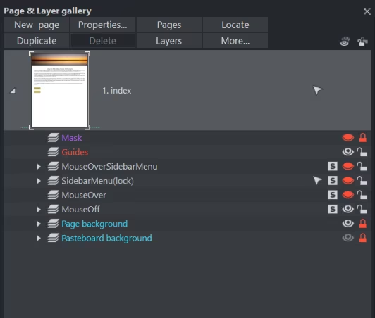

In this example the instructions for how this
works are shown in the desktop variant.